This is the āFirst Light Fazioli.ā I think I would like it more if you could fold the flylid backā¦
Also, I would love to try playing a piano where the white keys (as well as the black keys) are black, but I donāt think Iād like it for my home piano!
Hereās a nice video introducing many of the Fazioli artcase pianos. (Itās bugging me that Iām pretty sure she;s pronouncing Fazioli wrong, but other than that itās a great video!)
ā¦Ok, now Iām not sure about the pronunciationā¦ double āzzā in Italian is a ātsaā sound, and Iām thinking one āzā is more like āz,ā which would make Fazioli āfah-zee-oh-liā but maybe notā¦ maybe single āzā still has the hint of a ātā?
ShiroKuro Interview in Italian with Paulo Fazioli:
The Fazioli name gets repeated multiple times in the first couple minutes. To my ear, the āzā sounds like a subtle ātsā, and the ātā sound can almost disappear, such that the very first time the name is pronounced, to me it sounded like āFasioliā which is how it would be pronounced in Latin American Spanish.
To me, the biggest difference between Nahre Solās pronunciation and Roberto Prossedaās is not with the āzā sound but with the vowels. Iām not a linguist so Iām going to botch the terminology, but the āaā sounds more open/rounder in Italian, and the āoā sounds lengthened.
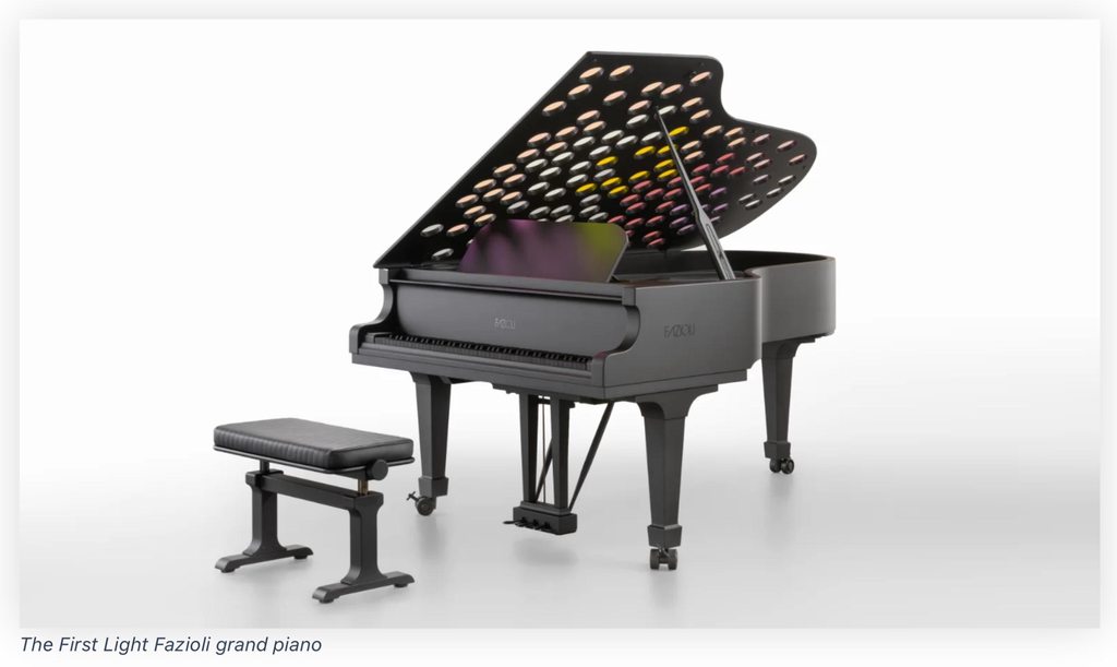
As regards the cases themselves, I think the 100% black keys would be very disorienting. I find art cases interesting. In the right spaces, I think they can work. But they really become a design element, and I think for most spaces, they would just look out of place.
A z in the middle is tz. Sometimes it sounds more like dz. A z at the start of a word sounds like dz. And zz in the middle is also tz, but sometimes also sounds more like dz. I don't know if there are official rules for it.
I think the difference with Nahre Sol is that it sounds like four syllables when she says it, fa tzi o li.
And in Italian it sounds more like three, Fa tzio li
When I started to learn the piano, I very much wanted coloured keys, like rainbows, with the same note in a different octave the same colour, and of course, coloured scores. But in the end, I have managed with black and white. But all black keys plus the distracting lights in the flylid - why make playing the piano even more difficult? I say No, no, no...
I really would like to try if it's more difficult. I think so too, but I'm not sure. Maybe it isn't. It does make me curious, but I don't think "Wow, that's a beautiful piano".
ShiroKuro I think I would like it more if you could fold the flylid backā¦
I totally agree about this. This may be a pianistās peeve, but to me the look of the open piano without the flylid looks unbalanced. It seems like there is no flylid, which also reduces the functionality of the instrumentā¦ it either has to be fully closed (canāt use the music stand) or fully open.
I am also not sure about the lighting/instrument. The effect seems to be heavily dependent on the lighting in the room, and at least from the video, it looks like there are parts of the piano where the colored glass effect gets lost, likely because of the lighting. On the other hand, the way the colors get subtly projected on the wall is kind of fun.
If I were trying to play this piano, I would find everything about it to be a huge distraction, but Iām sure the opportunity is not going to present itself, so no need for me to worry.
Sgisela Thanks for that video! You can hear his name being said at the beginning.... I think maybe her pronunciation is close, but she's emphasizing the ts sound too much, and that was what I was hearing? And also, my pronunciation was too strong of a "z" sound....
Maybe.
But they really become a design element, and I think for most spaces, they would just look out of place.
Yes definitely! For one thing, I think they need to be in very large spaces.
In the video I posted, I love how she chose the music with the piano in mind, that was fun. Plus the ones where she was wearing the white dress, to my eye, looked very nice.
Anyway, it's fun, but nothing something that would work in my (tiny) piano room!
Animisha I very much wanted coloured keys, like rainbows, with the same note in a different octave the same colour
I have seen a colorful keyboard like that, if I can remember where I'll post a photo.
The see-through portal effect is actually quite striking in the right light. But it makes me wonder about the conflict with direct sunlight on the piano being bad for it. What do you do when the piano kind of needs that for its visual appeal?
It would also seriously trigger my wife, who is pretty severely trypophobic
I actually love the black on black, including the keys. If you're going to make an art case, go all out! In the video, looks like one of the keys is sticking a bit, definitely needs that post-delivery adjustment.
I actually like seeing the stuck key in a video like this. It's such a good example of the fact that sticky keys upon delivery are NO BIG DEAL. It literally happens to the very best of instruments made, and is a fact of life for post-delivery adjustment.
ShiroKuro The piano looked kind of interesting though I think the black on black keyboard would make things difficult for me from a visual perspective. I find it difficult to comment on the sound of the piano. Why Fazioli used a "pound the keys as hard as humanly possible" performance to show the beauty of their new instrument mystifies me almost as much as why they failed to record the sound decently. Right now I would NOT accept this Fazioli as even trade for my Steinert.
There's a wide variety of opinions on this, when I looked at PW forum. The most popular ones are that it looks cool; or looks hideous; is over-the-top; or hey, it's good for piano industry.
I ultimately look at it as, a successful marketing decision by Fazioli to create this, as it garners attention. Even if it's gaudy to some, it certainly exudes that bling-ness to it and reinforces the word association between "Fazioli" with "world-class" "expensive" "luxury" etc.
Do I actually like that piano? Meh. But does it make sense (from an exposure standpoint) why they made it? Absolutely yes.