Ok, this is going to be long, so TIA for reading it!! Also, I guess this is sort of OT (OT-adjacent?) so thank you for indulging me!

In my old house, I had something like 12 prints on the walls in my piano room. That sounds like a lot, but it had a lot of wall space and most of the prints were not large .... In the new house, I think I want fewer prints but I want them to be larger. And I want to use stretched canvas w/o a glass front, so maybe the prints won't be framed. (I'm choosing this because glass is such a hard surface, it's not good for the acoustics).

Either way, I want to put some things on the walls in there. But I can't figure out which direction to go with the artwork.

Also I want the pieces to sort of match the rug but not necessarily really "match" the rug...

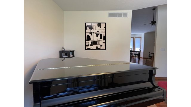
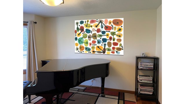
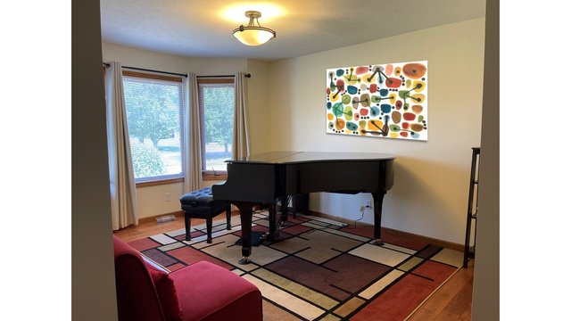
I do have one piece I already own that I know will go on the wall (as it happens, this is stretched canvas w/ a thin-ish frame and no glass). I had this in my previous piano room and I even had it in the rental house (it was literally the only thing on the walls in the rental). Here it is. This is a mock-up, the piece is not actually on the wall yet, but I think this is where it will go, and it's maybe roughly this size...

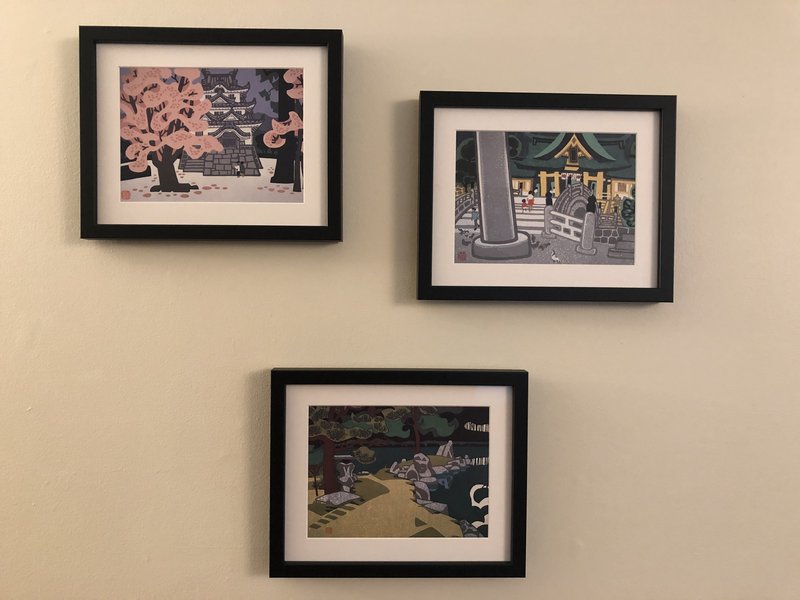
Now here's where it gets tricky. I have these two pieces (pics to follow), which I had on the wall in my previous piano room. But I can't decide if I actually want them on the wall in this room or not.... I might keep the smaller one but not the piano... Although I loved it in the past, now I'm thinking "do I need a print on the wall of a piano in a room that has an actual piano?" So maybe I'll get rid of the abstract piano?? But keep the colorful print?

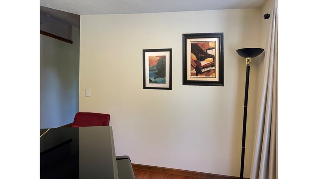
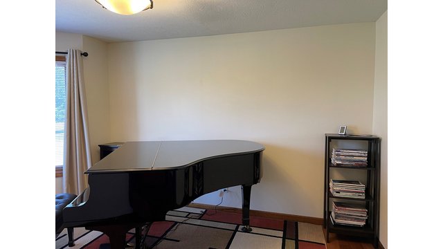
Anyway, this is the wall on the right, to the treble side of the piano. An important point is that I will see this artwork from the piano, but it's only visible once you're in the room. Oh! And here's the other big deal... This is probably the wall that has the most impact on acoustics (maybe??) so rather than these pieces, maybe this is the wall that needs a big stretched canvas piece??? Anyway, here's that wall with mock-ups of the pieces I already own. I pushed them to the right because I thought I would add something on the left?? And that's a red chair there that you can see the top of

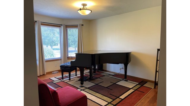
Now here is the wall that I most want to decorate for visual purposes, but I'm not sure how important it is acoustically. But you can see this wall when you come into the house, when you're walking through the entryway etc. It's the most visible because you don't have to enter the room to see it.

Here are two large pieces I thought might be candidates. Although I like both of these specific pieces, I'm thinking of these as concepts, so maybe I'll end up with something completely different, but first I feel like I want to choose which concept I like better....

Colorful:

Dramatic:

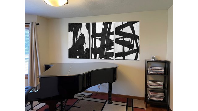
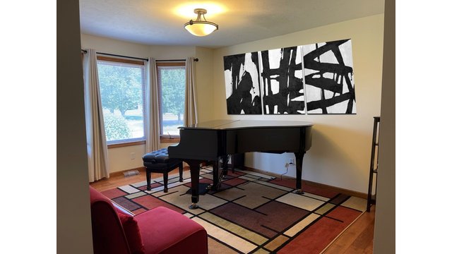
I can't decided which concept I like better... Mr. SK said he can't decide either. But one thing we thought was that the black and white set (it would actually three canvases) really doesn't match the abstract piano print, so the piano print might have to go... Whereas the colorful one kind of matches, or doesn't clash, the other pieces...

Anyway, art is hard (and you all might hate all of these pieces 😅 but if you have any suggestions about how to settle on a concept, I'd love to hear them!

Always being the 'odd' one - I actually like the 3 canvas black & white
Let me tell you why:
the lines of the canvas' match the black lines in the carpet
the black matches the piano

However as you said it doesn't match the abstract piano print

But I just wanted to tell you my initial thoughts
But you are the one who has to decide what you like and what you don't like.
brdwyguy

PS do the 3 canvas' HAVE to be placed together? what does one or two look like/feel like?

    Thanks for these comments @brdwyguy !!

    brdwyguy do the 3 canvas' HAVE to be placed together? what does one or two look like/feel like?

    Hmm, good question. This specific piece is sold as a set, but they are physically separate... So I could hang only one or two.
    Also, I need to see how much space it takes up on the wall, it might not be that much actually.

    I do like them together, and I like the horizontal orientation when they're like that...

    I think I can live without the abstract piano print in this room, I can find somewhere else for it to go, and I can find something else for that wall, if I end up with the three black and white pieces....

    Well I hate to be oppositional but I don't like either on that wall. I would rather go with a group of small frames, or one large wide one. And I would go with deliberately bland images because I would not want them to compete with the piano which is the centerpiece of that room. You don't want the bridesmaids to outshine the bride. This reminds me of the time I first met my wife, at a wedding where she was one of the bridesmaids and was about 20 times prettier than the bride, and the rest is history as they say.

      @Rubens thanks for this comment, it's super helpful!!

      Rubens I would not want them to compete with the piano which is the centerpiece of that room.

      I had not been thinking of it this way... Hmm, I will definitely think more about this. Even if I ultimately end up with some massive print there, it's helpful to think about it this way so I make an informed choice.

      Re this:

      Rubens I would rather go with a group of small frames

      I have several smaller prints (like, 8" x 10' or something) that I specifically don't want to put on that wall, because you can't really see the artwork. Like these:

      These were on the wall in the piano room at my old house (for reference, they're not exactly 8" x 10" but close), but the room was oriented differently, and you could walk right up to the wall and look at the up close if you wanted to. I feel like artwork this size would be wasted on the far side of the piano because you couldn't really see it well.

      But back to your original point... the large set of three pieces (B&W) definitely becomes the centerpiece of the room. Whether one thinks that detracts from the piano or adds to it is a separate question, but it's very bold...

      The colorful print with the rounded shapes maybe is less overpowering... Also, I think I can select the size, so I could get a size that's somewhat smaller than what I showed in the mock-up... That would also leave room to add more on the sides if I wanted to in the future...

        BTW for those who don't know, my husband is Japanese (and we lived in Japan for years before moving back to the states) and he really likes the black and white one, I think because it sort of looks like Japanese calligraphy brush strokes...

          Wow; those three black and white canvases make such a strong artistic statement analogous to the ebony piano making a strong musical statement . Really impressive as seen from the hall. To my mind makes the room look larger also. In my opinion the single multicolour canvas seems to clash with its surroundings...I am being very subjective and I beg your pardon.

            Maybe a large print of Ohara Koson?

            @keff thank you for these comments! I think your response is the same as mine, that set of three B&W is really a "wow" factor for me!

            keff To my mind makes the room look larger also.

            ah, I hadn't thought of that. Paradoxical, but I think you're right. Which reminds me, time to measure the actual size!

            In my opinion the single multicolour canvas seems to clash with its surroundings

            Hmm, ok, I'll keep that in mind.

            @Josephine thank you for the suggestion. Ohara Koson's prints are lovely, but I prefer a more modern style in this room. Although one of my prints is a Hasui, it's a little more abstract (and doesn't have any animals etc.)

            Ahh, the set of 3 is 24' x 48" ... Hmm, that might be a tad long... I think 48" is longer than the distance from the piano's fly-lid seem to the tail... gonna go measure...

            yep, that part of the piano lid is about 46' .... hmmmm

            I think it's clear that there are no rules, but to me the black and white reminds me of Motherwell which reminds me of kindergarten art and it probably would to most guests, but then again I am an uncultured philistine (at least in visual arts) so don't listen to me. And you don't decorate your room for the guests, you do it for yourself!
            Ok I'ma go back to practice ma piano, talk later.

              Rubens Well I hate to be oppositional but I don't like either on that wall. I would rather go with a group of small frames, or one large wide one.

              I agree, I don't feel that either of the big canvases have the right proportions for the space. But if I had to choose between them I like the colorful one far more. The black and white one seems very "aggressive" to me while the colorful one feels more neutral.

              Rubens Motherwell which reminds me of kindergarten art and it probably would to most guests,

              Rubens, I had never heard of Motherwell, thanks for mentioning it! Interesting that Motherwell reminds you of kindergarten, your kindergarten must have been much fancier than mine!! 😁

              but then again I am an uncultured philistine (at least in visual arts) so don't listen to me.

              No, no, don't say that! I am pretty ignorant about art as well (for evidence, note that I hadn't heard of Motherwell before, so...). Like most of us, I know a little bit about the things I like and know almost nothing about anything else. And that's ok.

              But what I do know is that it can be hard to visualize these things, and I don't want to spend a bunch of money only to decide that I don't like it. And getting advice from other is very helpful to me (even if I reject some of it!) Hence this thread.

              And you don't decorate your room for the guests, you do it for yourself !

              This is a very good point! But at the same time, I don't want people to come over and think "oh what a stupid way to decorate the room" ... so it's a hard balance to strike.

              @twocats yes, that black and white one is definitely aggressive... 😅

              Interestingly enough, it occurs to me that the black and white one goes rather with the Einaudi pieces I play, while the colorful one goes nicely with Alexis Ffrench's pieces... 🤔
              (pretty sure I'm the only person who would think that....)

              ShiroKuro BTW for those who don't know, my husband is Japanese (and we lived in Japan for years before moving back to the states)

              Ah, that's probably why you played the music of Ryuichi Sakamoto, one of my favorite composers. His piece Merry Christmas Mr. Lawrence is a pure gem. Magical!

              @Rubens Yes! I was living in Japan when Ryuichi Sakamoto's piece "Energy Flow" was released in Japan in 1999, and as it happens, that's the year I got married and the year I started playing piano.

              Merry Christmas Mr. Lawrence is one of my all-time favorites! I have played/practiced it a few times over the years, putting it away because it was just hard enough that I could quite get it polished. The last time I worked on it, I felt like it was right about my level, but then I put it aside (because I was just starting a new position). I have actually been planning to revisit it this fall. 🙂

              Some other pieces of his that I've played are: Yamazaki 2000, Put Your Hands Up, and Popoya. If you don't know them, give a listen 🎶

                ShiroKuro Yamazaki 2000, Put Your Hands Up, and Popoya. If you don't know them, give a listen 🎶

                I know them all! But Merry Christmas is still my favorite. Especially those snowflakes in the beginning.

                I had not come across Ryuichi Sakamoto until a friend of mine sent me the score of Merry Christmas Mr.L and asked if I would play it at her piano group. That must have been 2017 and I repeated it at the December meeting 2019. I think my copy is an arrangement because the coda seems a little different to Sakamoto's own recording.