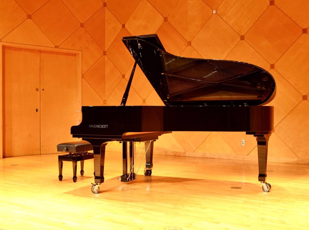
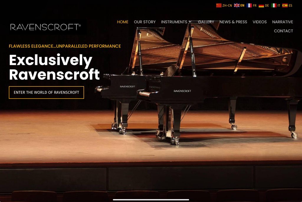
brdwyguy could be! I was actually going to complain about the name (I don’t like that “s’ in there!) but then I realized it’s the surname of one of the owners, so it can’t be helped. 😅 But “Ravencroft” would sound better to me, so maybe it would look better too!’’
Actually, the more I look at it, I think it’s just the logo. All the letters are the same size, and they’re smooshed together. Obviously, that’s a design choice, but it’s a choice I dislike! 😆